The article focused on the basics of color theory and color combinations in design: learn more about color wheel, RGB, CMYK and models of color harmony.
Many people think the choice of colors for UI mostly depends on the designer’s taste and sense of beauty. However, the process of color selection is more complicated than it seems and plays a significant role in design. In one of our previous articles devoted to color psychology, we’ve found out that colors have a great impact on our mood and behavior. That’s why the success of the product depends largely upon the colors chosen for the design. The research showed that it takes only 90 seconds for people to make a subconscious judgment about a product and between 62% and 90% of that assessment is based on color alone. So, the appropriately chosen colors can be useful on the way of improved conversion for your product as well as advance usability of the product.
To create good design and employ colors more effectively, you need to understand how colors are formed and how they relate to each other. That’s why students at art schools, colleges and universities study the science of color theory devoted to colors’ nature. Today, we offer you to remember (or maybe even learn) the basics of color theory about the color combination which can be effectively applied in your design creating process.
Color Wheel
If you had any lessons related to painting, you must have seen the circle consisting of different colors. It is called the color wheel which helps to understand how different colors relate to each other and how they can be combined. The color circle is usually built of primary, secondary and tertiary colors. The primary are those three pigment colors that can not be formed by any combination of other colors. Combining primary colors, we get the secondary ones, and the mix of the primary and secondary colors gives us the tertiary colors which usually have two-word names such as red-violet.
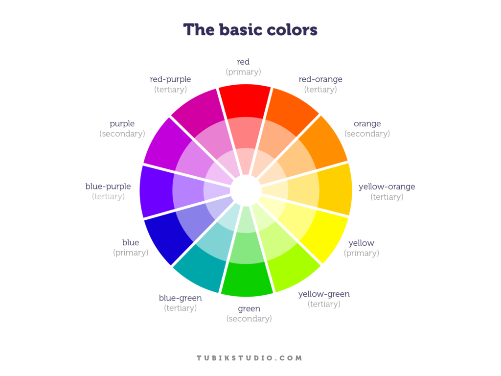
The color circle was created in 1666 by Isaac Newton in a schematic way and since then it has gone through many transformations but still remains the main tool for color combination. The main idea is that the color wheel must be made that way so colors would be mixed appropriately.
Color models
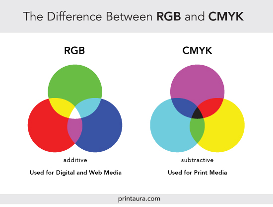
Before you start mixing colors you need to understand that color has two different natures: the tangible colors which are the surface of objects and the others which are produced by light such as the beams of TV. These types create two-color models by which the color wheel is formed: additive and subtractive.
The additive color model considers red, blue, and green as primary colors so it’s also known as the RGB color system. This model is the basis of all colors used on the screen. The combination of primary colors in equal proportions of this system produces secondary colors which are cyan, magenta and yellow, but you need to remember that the more light you add, the brighter and lighter the color becomes. Results obtained by mixing additive colors are often counterintuitive for people accustomed to the subtractive color system of paints, dyes, inks, and other tangible objects.
The subtractive color model obtains colors by the subtraction of light. It consists of two color systems. The first is RYB (red, yellow, blue) also known as the artistic system often used in art education, especially in painting. RYB was the basis for the modern scientific color theory which determined that cyan, magenta, and yellow are the most effective set of three colors to combine. This is how the color model CMY has been formed. It was mostly used in printing and when the photomechanical printing included black ink, the key component, the system was named CMYK (cyan, magenta, yellow, and black). Without this additional pigment, the shade closest to black would be muddy brown.